


Soul Seekers series by Alyson Noel


Fallen series by Lauren Kate

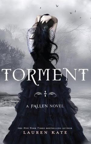


I don't think I can compare covers and not include this series in these posts. I've pretty much loved most of them so I knew I had to include them eventually. I think that for the most part, Luce and her pretty black dresses (and one white one) knock it out of the park. My only exception to this rule is Passion. That cover has always driven me crazy because it doesn't work. Whoever worked on that cover touched up the model's arms to the point that they are non-existant. The girl's arms and shoulders look like a skeleton which totally takes away from the cover for me. I think my favorite of the series is actually Rapture but that might be because it stands out with its white dress.
Matched triology by Ally Condie


I remember seeing the cover for Matched on a blog before I was blogging anf being completely in love with it. After the spines and spines of black and dark blue, here was a white cover and it was so striking. I love everything about the cover for Matched still. Then I saw the cover for Crossed and was so disappointed. It didn't have half as much appeal as Crossed. Luckily, they made up for it with Reached which is back to its gorgeous appeal. I still think I like Matched best out of the bunch though!
Watersong series by Amanda Hocking


This is another novel that I fell in love with at first sight. The water is so blue and looks inviting but the skyline and moon look ominus. It's hard not to keep looking. I think Lullaby is the same way. It shows the turmoil of the first novel in the crashing waves and I love how the girl (who I'm assuming is Harper) isn't in the water because she's never gotten the allure of it. Both covers really work for me together and as a pair.
So there you have my set of four covers. I'm not sure if I can pick a favorite of the bunch though it seems that so far the Watersong series has been consistently strong. However, the fact that only one out of the five Lauren Kate covers bothers me are still pretty good stats.
Which covers are your favorite?


Have you seen the covers for the Chemical Garden Trilogy by Lauren DeStefano? Wither, Fever, and Sever? They are gorgeous and go together so well!
ReplyDeleteOh I love that Echo cover! Those look great together!
ReplyDeleteI love the dresses in Fallen and the same gos for Matched! I recently got Wake and i can't wait to settle down with it. I love the Lullaby cover! The different shades of blue looks so inviting! :)
ReplyDeleteThe Fated/Echo covers don't look super similar, but they really do work together somehow.
ReplyDeleteOMG, thank you for pointing out her arms. What the heck? Someone force feed that girl some McDonalds stat. She needs calories and she needs them NOW.
The Matched trilogy covers are nice, but a bit cheesy.
I love the cover for Lullaby. So pretty, but they don't look like a series to me.