


I hope you enjoy!
This version of Cover Envy is going to be a special version because I'm going to showcase a series with covers I can't live without!


Fallen Series by Lauren Kate
Did it hurt... when you fell from heaven? *Couldn't resist the excuse to use a cheesy pickup line*. But seriously, these covers are gorgeous and create a lot of Envy from me. I love how each cover creates a certain bleak mood with the background colors and somber pose of the model.
Fallen- I love the blue background. It fits perfectly with the novel and Luce is always describing how she hates forests because of the shadows. For me, the model looks like Luce and I like how she has her face buried in her hands as it express the sorrow that this novel starts out with. There is a photo described in the novel where Luce is wearing a black dress and has gloves on her hands that show her fingers. I've always thought the gloves were such an interesting touch and my eye was drawn to them. So g;ad there is a reasoning behind it!
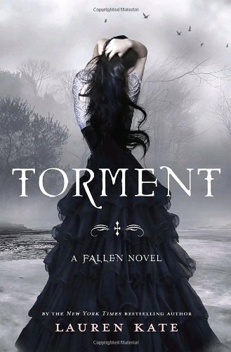
Torment- We follow the same black dress, long black hair theme but this time on a completely new color palette. I like that the model was carried over and so were the ravens from the first cover. It instantly allows me to identify that this novel is in the Fallen series. This cover for me really shows Luce's confusion which is great because she's trying to sort though a lot in this second installment. Again, we get the beautiful dress with the interesting detail of the shaw or undershirt sticking out, adding something a little extra to stare at.
Passion- I wish the birds had carried over. Regardless, the second I saw this, I knew it was part of the Fallen series and that's exactly what it needed to do. I'm with the others though when they say that this is their least favorite of the three but I have odd reasoning-- the model's arms got too skinny. It looks like the hacked them off with photoshop and now she looks sickly especially with her head being down. I love the blue in the background but I could have down without the yellow clouds and I think the added touch of the red rose is beautiful.
Altogether, this is a beautiful set of covers and I can't wait to see what the final installment will look like.
So what are you envying this week?


I love the first two covers, but I hate the third. It looks like a cartoon in my humble yet honest opinion.
ReplyDeleteI haven't read any of these so I can't speak to their content (though from what I can tell it seems to be a 'love it or hate it' kind of book) but I totally agree with you on the covers, they're gorgeous. I know a lot of people haven't been too thrilled with Passion but I like that it's got more color, particularly that red rose. Now that you point it out, though, you are so right that the girl's arms look unhealthily thin.
ReplyDelete