I love that this one captures the gothic, romantic feel of the old south. That is what made me pick up the very first novel originally and it is one of my favorite things about reading literature from the south. Everything has the old timey feel which is romantic and just a little spooky.
Here's the new book cover on the same backdrop with the cast:
Again, I love how this captures the feel of the book while adding in the movie. I actually think this is a very successful movie cover tie-in.
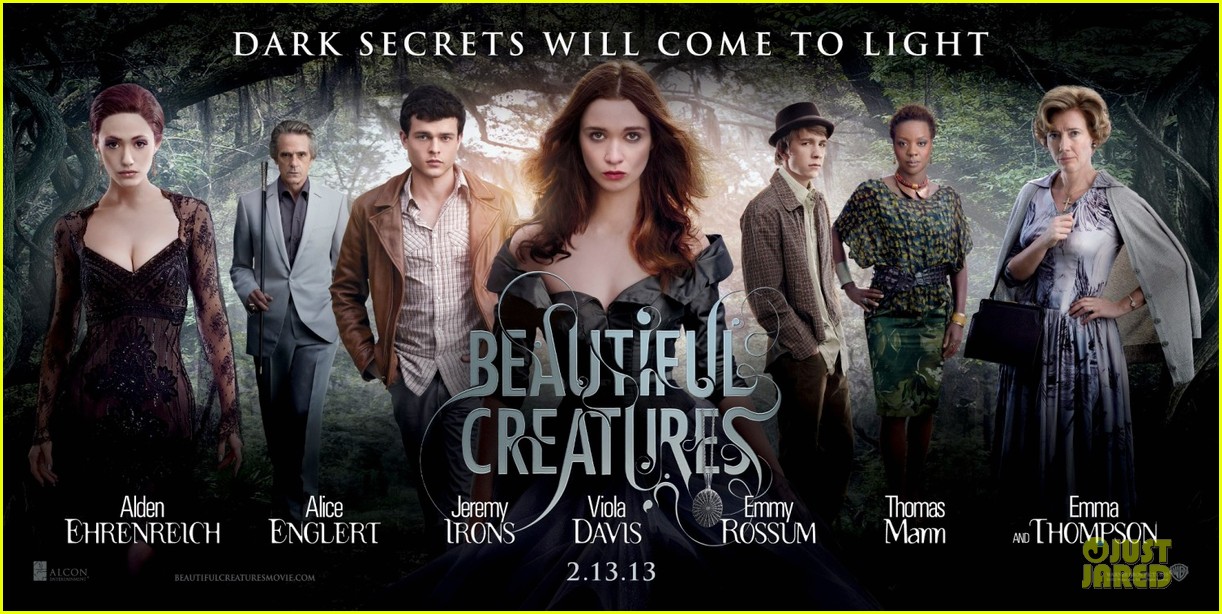
Here's a large promotional poster featuring the cast:
And now here are the individual character posters!
Lena:
I love this because she looks powerful and fierce. We're definitely getting a strong vibe from her and she is still looking girly in her awesome black dress.
Ethan:
Again, they were able to capture this moody background with the moss hanging from the trees. The actor himself isn't as impressive in his regular guy clothes but that is the character he is playing...a regular guy.
Ridley:
Yeah, and here we thought Lena was fierce. This outfit and pose could cut any man or woman down to size in a second. I wouldn't be messing with her any time soon. Gorgeous!
Amma:
This is a great shot and I love hos the sunlight is bursting through her arm which suggests a hint of magic from those hands.
Link:
I think this outfit choice is more interesting than Ethan's because it tells me a lot about the character. He almost looks like he's dressed in an elderly man's outfit. That tagline "friendship is sometimes led astray" has me very curious.
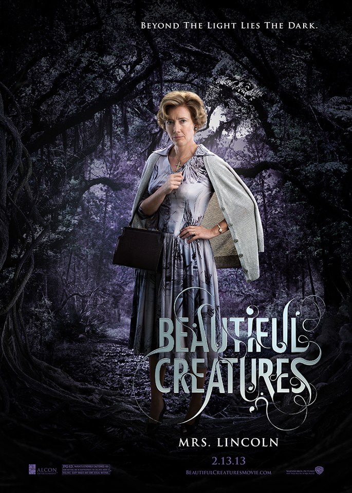
Ms. Lincoln:
She looks like the normal Southern lady but I love that she was put on a dark background with a dark tagline. It lets us know there is some bad stuff brewing just underneath her polished exterior.
Macon:
Again, a well dressed man in light clothing set against a dark background with a menacing tagline. Not all is what it seems!It looks to me like the makers of this film really anted to do it right. From the posters to the not overly cheesy movie trailer, they are hitting the mark on every front. I'll tell you what, I was excited about the casting choice (based solely on acting chops) before but after seeing everything they are putting out and their attention to detail, I am dying now. This is just awesome!
In case you happened to miss the movie trailer, check it out:
So are you as stoked as I am? Sound off below!















I am really interested, I haven't read the book yet but I picked up a copy this week!
ReplyDeleteI'm super excited for this movie, even more than "City of Bones," I think. Even though I liked Cassie's books better, I think this movie looks like it's better made. And they have SO MANY good actors! I mean, how can you argue with Jeremy Irons?!
ReplyDelete