So this is going to be a reoccurring post on my blog and for the first one ever, I'd like to start out with a bang and do the top 5 book series covers I love together! So without further adieu and in no particular order, here we go!
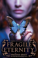
1. Melissa Marr's Wicked Lovely series- All the covers look great on their own but together, they are a sight to behold! Each cover evokes this dark mood that emanates in Marr's novels. The covers get better with age! My favorite has to be the last Darkest Mercy because the colors so incredibly vivid and beautiful.
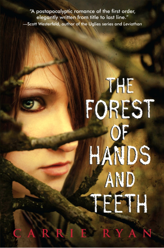
2. Carrie Ryan's Forest of Teeth and Hands Series- It's a bit of a shocker to me that these books are making the list because I was not wild about the first cover. I got a shock when I saw the paperback cover for The Forest of Hands and Teeth. The model looks mysterious, the tree branches look like they are trapping her in and the sepia color tone really sets up good mood. The Dead-Tossed Waves hardback cover didn't disappoint either!


3. Maggie Stiefvater's Wolves of Mercy Falls series- These covers are timeless. I walked into the bookstore and was sucker punch by Shiver staring back at me on the bookshelf. Again, these covers do an awesome job for the setting the mood for the stories. I love follow the vines on the covers to see what other shapes they morph into and the splashes of blood are just genius! Plus, with the different colors, they look great as a set.


4. Becca Fitzpatrick's Hush Hush series- These covers have me hooked. Both do such a great job of evoking the feeling of (at least the first) novel. I love the feathers swirling down on the first cover and the position the male model is in. He looks like he is in so much pain. The second cover is really great because one of my strongest memories of the first novel is about the fog always floating around her house and Crescendo evokes that for me.
5. Carrie Jones's Need Series- I've always dug dark covers. I really like how these covers utilize black, white and grey by adding a pop of color so that it really stands out. As with the Wicked Lovely series above, each cover gets better with time. I saw the third cover somewhere pretty recently and if it stays the same, it will be even better than the other two!


There were a lot of honorable mentions that didn't make it on to my top 5 that I want to throw out like The Gemma Doyle trilogy by Libba Bray, The Twilight Sage by Stephanie Meyer, the Harry Potter series by J.K Rowling, The Books of Pellinor by Alison Croggan and L.A. Candy novels by Lauren Conrad to name a few.
The most recent cover I saw that gave me bad cover envy is Carrie (apparently I have a thing for Carrie covers) Harris. The novel is called Bad Taste in Boys and I first caught the cover on her agent's website, Kate Schafer. Here it is:
There is a little blurb (that I got from http://ktliterary.com/2010/07/another-fabulous-cover/) about the book:
Someone’s been a very bad zombie.
Unless she finds an antidote, no one is safe. Not Aaron, not Kate’s brother, not her best friend . . . not even Kate . . .
It’s scary. It’s twisted. It’s sick. It’s high school.
Because of the awesome cover and the blurb, this is a novel I'm really looking forward to!


Wow. My cover gets to hang with some really COOL covers. Thanks for posting it!
ReplyDeleteAnd have you seen the cover for The Dark and Hollow Places by Carrie Ryan? I think it's the best of the three!
Awesome covers!
ReplyDeleteCarrie,
ReplyDeleteI have seen the new cover for Carrie Ryan's The Dark and Hollow Places but couldn't find it when I went to look for it again. I checked her website and everything. I agree with you though, it was really amazing.
Again, can't wait to see your novel in stores!